Visualizing Sea level rise
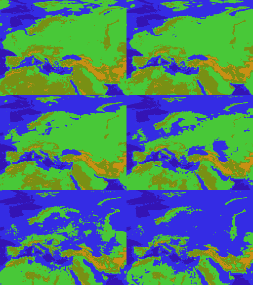
Something like 15 years ago I put together some geographical data I found online containing European elevation and created a GIF out of it showing how Europe would be impacted at various amounts of sea level rise. People liked it — it was a simpler time when being able to create a GIF out of data made you a data wizard.

It always vaguely bothered me that it only covered Europe though and so I was happy to see that MapBox published a global dataset of elevation. If you are thinking, didn’t NASA or so not have datasets like that, you are of course absolutely right. Those are gnarly to process though and since it only vaguely bothered me, that was enough to stop me until MapBox did the presumably gnarly work.

Although creating a larger GIF covering the entire planet was now within reach, it didn’t necessarily seem like the best way forward. Showing which parts of the planet are vulnerable to sea level rise is of course somewhat interesting, but what really matters is how many people actually live there. The Center for International Earth Science Information Network publishes a neat data set with global population density and so we can just combine the two.

The result is the new sealevel project. It’s basically 9 high-ish resolution maps (8k x 4k) showing the earth at different levels of water, with the land masses colored according to population density. The 500 meter map is mostly for reference; I don’t think even the most pessimistic models see the oceans rise by that much.

Oh, there’s also a video:
Some more data fun
We can plot the data directly of course, by projecting the population against the elevation. The graph below show for each interval of 10 meters how many live in that bracket. Below 10m there are not all that many people, but it actually goes down quite a bit; the dead sea is at -430m and there’s a decent amount of density around it. Up to 100m or so, the number of people drops off quite quickly but then stabilizes, somewhat unexpectedly.

We can also reverse the colors; rather than showing the population density of areas that are not in danger, we can show which areas are and color them the same way — leave the areas that are not just dark. Especially on lower levels of sea rise it shows more clearly where the risks are since the coastal cities light up really clearly.

How this works
The code to get this working can be found on GitHub and is all fairly straightforward. Rasterio lets us read GeoTiffs as numpy arrays and once we have those, we’re off to the races. There is probably a better way to convert the data to an RGB something like auto mapping the elevation and population data to integers and doing a lookup, but filling in the bitmap pixel by pixel works too — it takes a few minutes which is slow, but faster than doing the clever thing.
Similarly, I ended up reprojecting the elevation data from MapBox to the projection used for the population data; the first is in web mercator, while the latter just lat/lng pairs as indexes into the bitmap. The math is pretty straightforward and other suggestions on the internet only lead to frustration.
